Designing for ‘Low & No’ alcohol brands
by Paolo Ventrone
on 07/01/2026
The UK low and no alcoholic drinks market has moved beyond novelty and niche, into a new advanced growth phase. With increasing consumer appetite for moderation, health awareness and flavour-first alternatives; brands face a rich and rapidly changing terrain. For design teams working on packaging, brand identity and visual systems for low and no alcohol products, our opportunities are endless. As we look ahead to 2026, there are some key design points the low and no alcohol creatives are considering…
Premium & credible
Consumers expect a sophisticated, adult experience from low and no alcohol drinks –they aren’t looking for a ‘second best’ option. The packaging is essential in delivering this expectation; using quality finishes, considered typography, confident and restrained colour palettes, and visual cues of craftsmanship. A recent article by Beverage Daily’s Rachel Arthur says, there’s a “dramatic, almost theatrical evolution of packaging1” and within the low and no alcohol category, this trend toward premium and sophisticated design is especially prominent.
Designers also now approach low and no alcohol beverages as premium propositions, not budget alternatives. Elements that depict provenance – ingredients, botanicals, or barrel-ageing, for example – effectively communicate care and expertise; in line with established spirit brands. Premium cues, such as metallic or foil detailing, can further elevate the product.
Seedlip, a standout in the UK’s low and no spirits market, exemplifies this approach. Its product range demonstrates premiumisation through distinctive bottles, clear labelling with an elegant blend of botanical illustrations and typography. Their restrained palette and refined yet playful design present Seedlip as an adult alternative, treating no alcohol as its own sophisticated category.
Honest & transparent
Packaging must be clear about what the product is, what it does and how it benefits. Labels should communicate the alcohol level, ingredients, provenance, flavour profile and any wellness or functional claims. According to a low and no alcohol article from the website of expert Lara Caiulo, “honest labelling that clearly communicates ingredients and benefits builds trust2”. We completely agree! From a design perspective, leaving space for legible ABV declarations (0.0%, 0.5% etc), flavour and botanical descriptors mean you avoid the cheap copy of full strength brand, enhancing the low and no alcohol experience. The Reformed Characters brand took a very deliberate design route; bold metallic cans, strong illustration of character, personality-first language. Its “Unapologetically Alcohol-Free” angle is hard-hitting. This example shows how the low and no space can benefit from brave visual design, playful tone of voice and packaging that looks as good on a bar shelf as any alcoholic alternative. It challenges the lesser version mindset and treats the design as part of the brand story.
Sustainable & ethical
Packaging is increasingly being judged on more than just aesthetics. Sustainable, reusable, recycled materials and minimal waste are key. Packaging trends highlight that “circularity… reusable structures, recyclable materials or modular formats that live beyond the first pour3” are important. Low and no alcohol brands can adopt lightweight glass, recycled aluminium cans, minimal plastic, clear recycling labelling, or even ‘refillable’ or ‘returnable’ formats to really hone in on this need, and make it a key component of their brand ethos.
Lifestyle & occasion
Low and no alcoholic drinks are often chosen for specific occasions (weeknight socialising, designated driver, sober curious, working lunches, zebra striping4). Designers are able to bring creativity to the message, reflecting not only less alcohol but “right for this moment”. Designers can help reposition the drink away from an “alternative drink” to part of a lifestyle. We consider whether the product is perfect for a bar occasion (on-trade glassware, tap handles, coasters) or home-consumption (can, bottle, multipack). The packaging shape, serve suggestion and visual language should match. For example, cans are for casual easy social sharing, bottles for elegant dining or tap handle and a pint glass for out-out drinking. It all helps build a cohesive experience, individual to each consumer. While no alcohol remains the core benefit, design incorporates the idea of added value: wellness, botanicals, flavours, mood-enhancement, social confidence through many avenues. Adaptogen icons, botanical illustrations, mood words (calm, focus, unwind) enhance the idea of benefits beyond enjoyment. Sub-brands can even emerge differentiated by benefit claims.
Distinctiveness
A risky path for many low and no brands is leaning too heavily into mimicking full-alcohol equivalents (same bottle shape, same colour scheme, using the blue 0.0 labelling), thereby inviting comparison and perhaps being seen as a lesser alternative. Successful designs lean into ownable brand territory, using the distinctiveness of a low and no alcohol to stand apart. Bold typography, stand-out patterns, bespoke illustration and unique bottle shapes can all help a brand express individual personalities. Take Crodino for example – originally an Italian aperitif founded in the 1960s – their UK expansion shows how a non-alcoholic drink can draw on heritage and flavour cues (a bitter-sweet orange). But from a design perspective, the orange tone is key, the bottle silhouette is premium; all harking back to Italian style. The product messaging is clear – “aperitivo without alcohol”. A perfect lesson in clarity of occasion and bold signature colour.
Author’s thoughts…
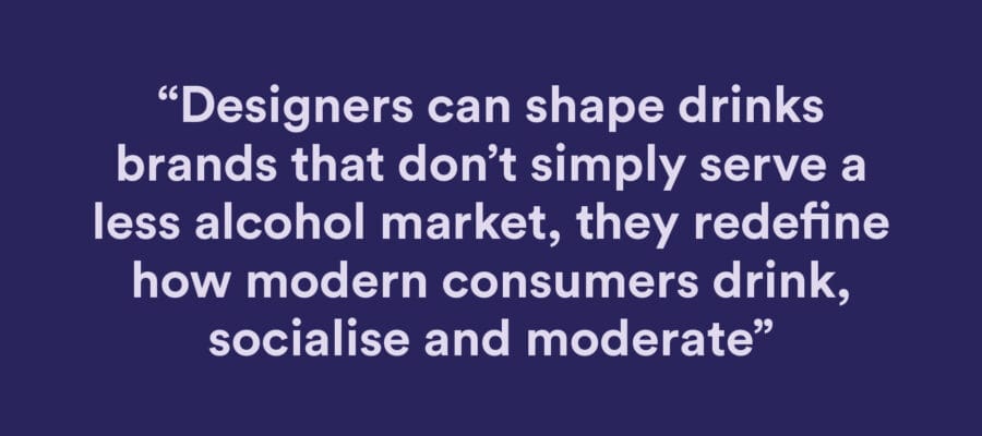
Stepping into the low and no alcohol drinks sector, the challenge is not just to strip out alcohol cues, but to build a compelling, future-ready brand that stands for flavour, occasion, design integrity and credibility. The marketplace is evolving fast and by 2026 the winners will be those brands whose design work treats the proposition as a premium alternative, not as an after-thought. By leaning into premium cues, honest communication, sustainability, occasion alignment and thoughtful brand clarity, designers can shape drinks brands that don’t simply serve a less alcohol market, they redefine how modern consumers drink, socialise and moderate.
Bio: Paolo Ventrone – Client Services Director at Eat With Your Eyes
A highly experienced Account Director with excellent strategic thinking and communication skills.