Hot Off the Press
by Steve Oakey
on 09/08/2016
The top branding trend for 2016 is the return of the letterpress type style.
This trend is particularly prevalent in food related design and marketing. Letterpress styling characteristics evoke many of the traits brands want you to associate with their experience.
Many current food brands [especially fast casual] want to tell a unique story of hand crafted individuality in a bold and confident way – an approach that’s non-corporate and really conversational. They want to call on a trusted heritage but show a hip modern edge too. Letterpress typefaces capture all of these values.
Check out the logo for Caravan, Jamies Italian menus and Brewdog packaging. Also take a look at as our Debenhams and Fuller’s work.
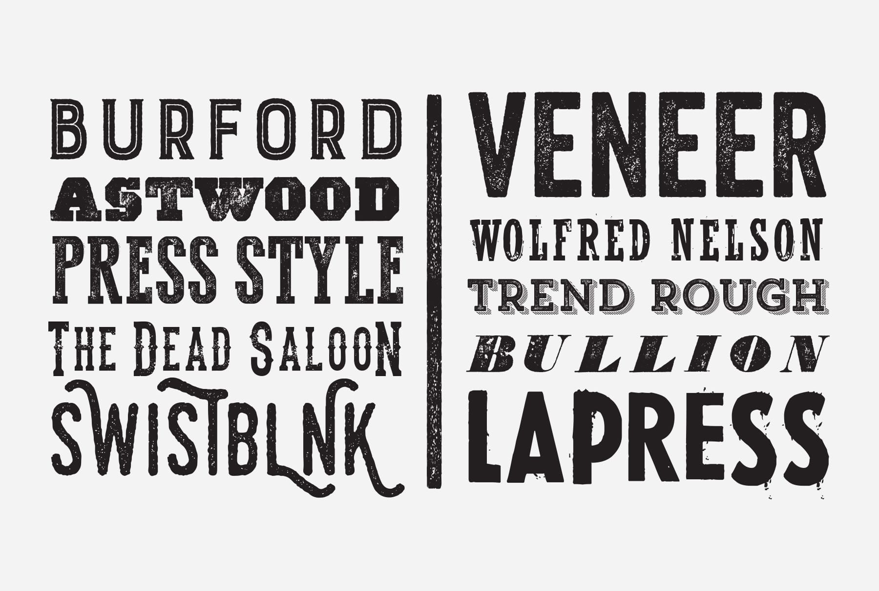
Our design experience tells us letterpress typefaces are best used sparingly for bold, simple messages and type stacks. Eat With Your Eyes have 10 current favourite press fonts [see above]. We find they usually read clearer displayed as uppercase and we never use them for small / body copy. It’s always best to customise them too – making them personal and unique to a brand story. Remember… It’s a sin to overuse them – don’t fall into the type trend trap.


