Out with the new, in with the old
by Jake Lockett
on 11/10/2016
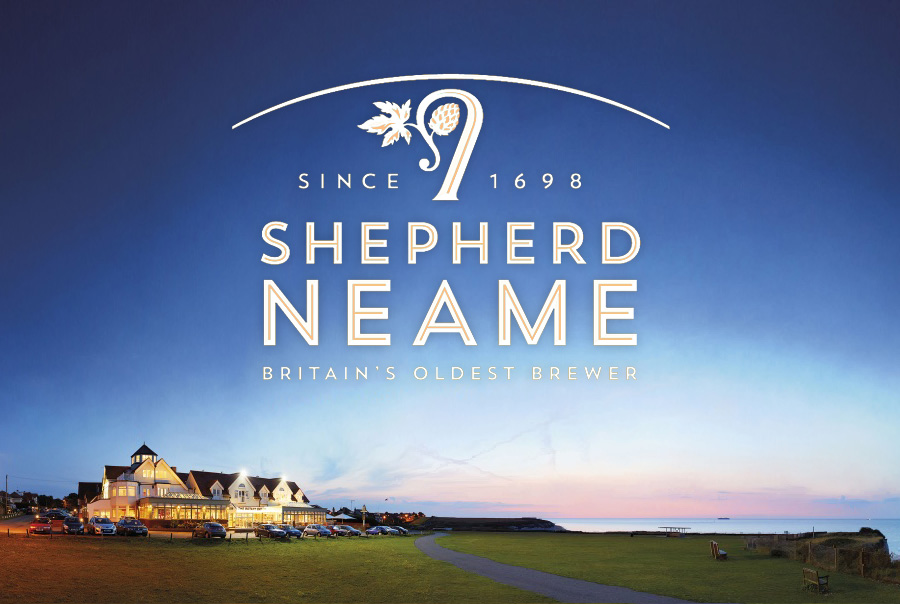
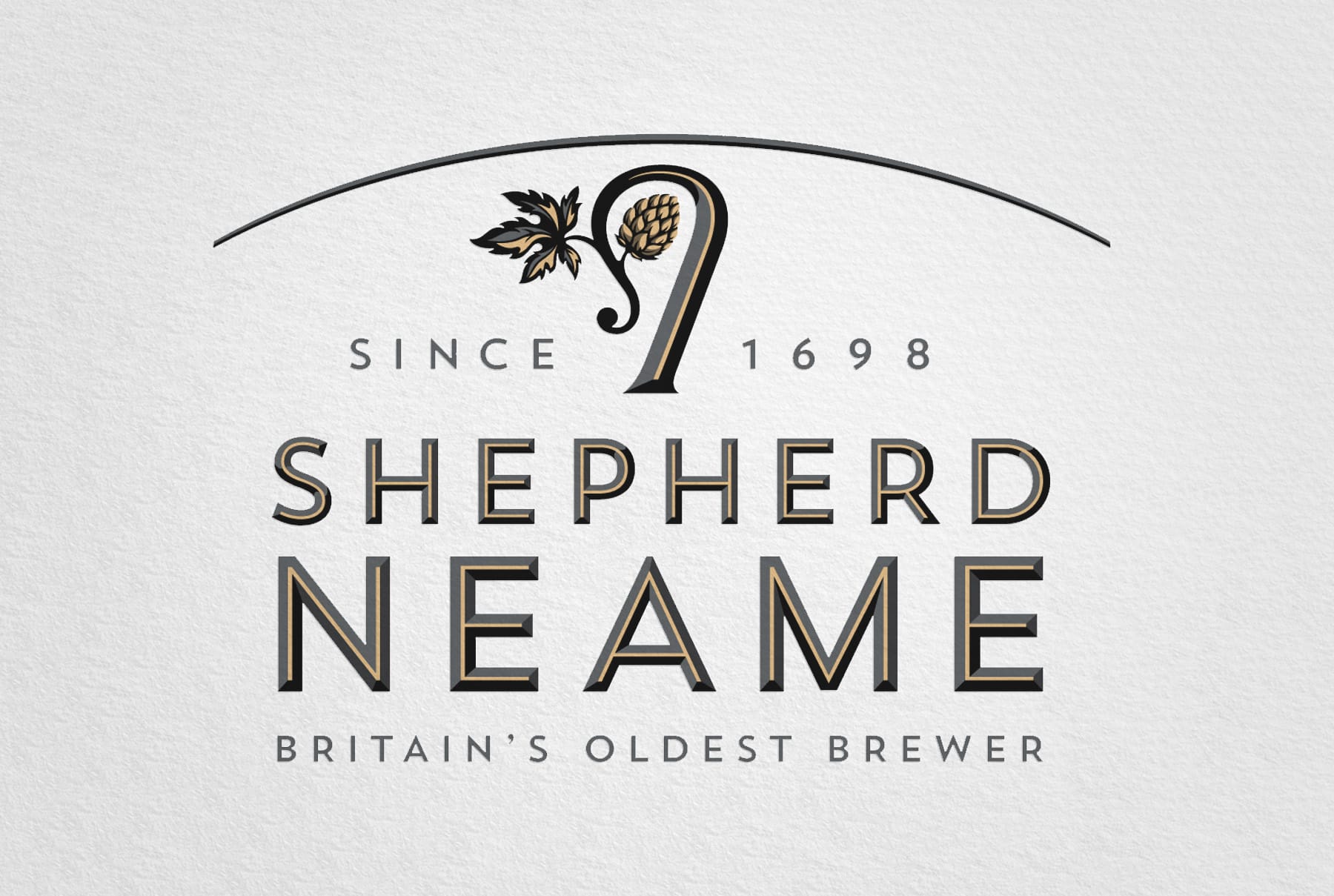
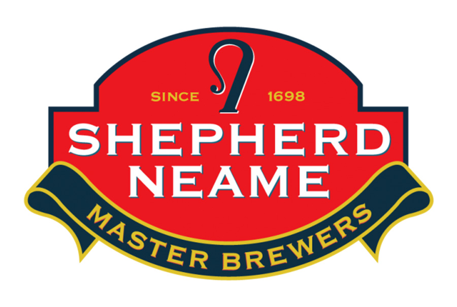
Shepherd Neame, the oldest brewery in Britain has been rebranded for the first time in 18 years. The work was done by design consultancy JDO over the course of 18 months with the aim of incorporating craft and heritage into a simple, contemporary logo. Comparing the new mark to the old, it is a more consistent logo, giving it a simple clarity that the last lacked. It follows the trend of minimalism without adhering to the constraints post-industrial modernism.
JDO creative director Ray Smith says “We’ve given the traditional crook a more natural, organic feel by lacing in the hop leaf detail, many beer companies now are stripping things back and keeping it simple, so we’ve attempted to add finesse and refer to craft and quality.”
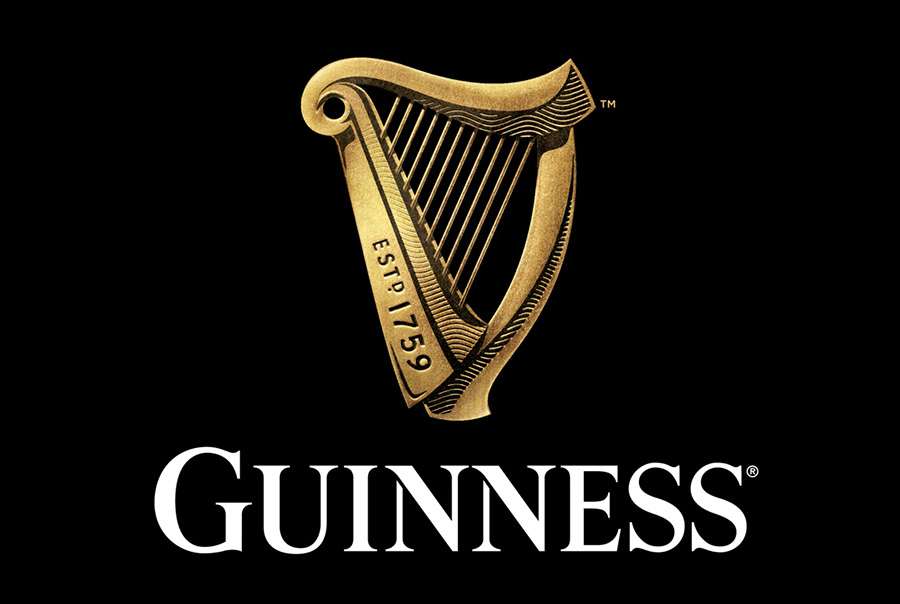
The retention and embellishment of the shepherd’s staff icon is reminiscent of Guinness’ recent redesign. I really enjoy the new Guinness logo, but however beautiful, the indulgent, overly detailed Guinness harp could be cumbersome to use as an asset in broader applications and may need to be simplified for some purposes. The Shepherd Neame logo avoids this pitfall while keeping its heritage intact, no small feat.