Punk’s not dead. It’s just grown up.
by Chris Brown
on 17/03/2020
I must admit, I’m a massive fan of Brewdog. I enjoy the beers they produce, and have frequented their flagship bars and attended tasting sessions. As a brand they’ve always been game-changers, and consistently look at disruptive and interesting ways of refining the craft beer sector, introducing initiatives such as promoting new alcohol-free beers (including the world’s first alcohol-free bar in Old Street) to more public business nodes with its Equity for Punks scheme.
There’s no doubt for many years they’ve stood out, but as more and more independent breweries and brands appear, now is probably the right time for them to look to the future, so with that comes the launch of a brand spanking new visual identity, that sits in line with a brave sustainability initiative.
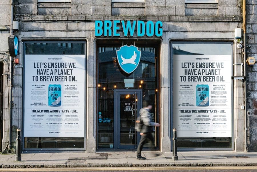
The ‘BrewDog Tomorrow’ plan comprises of six points that aim to better serve the people and the planet, among these are the up-cycling of old cans from any brand, turning imperfect beer that would usually be wasted into vodka, home brewing kits and incentives for the public to trade in empty beer cans, all of which are radically putting their money where their mouth is, in rewarding the environment.
The question is for a brand that was built around its independence has it now lost some of its spirit?
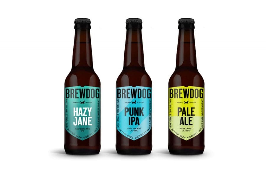
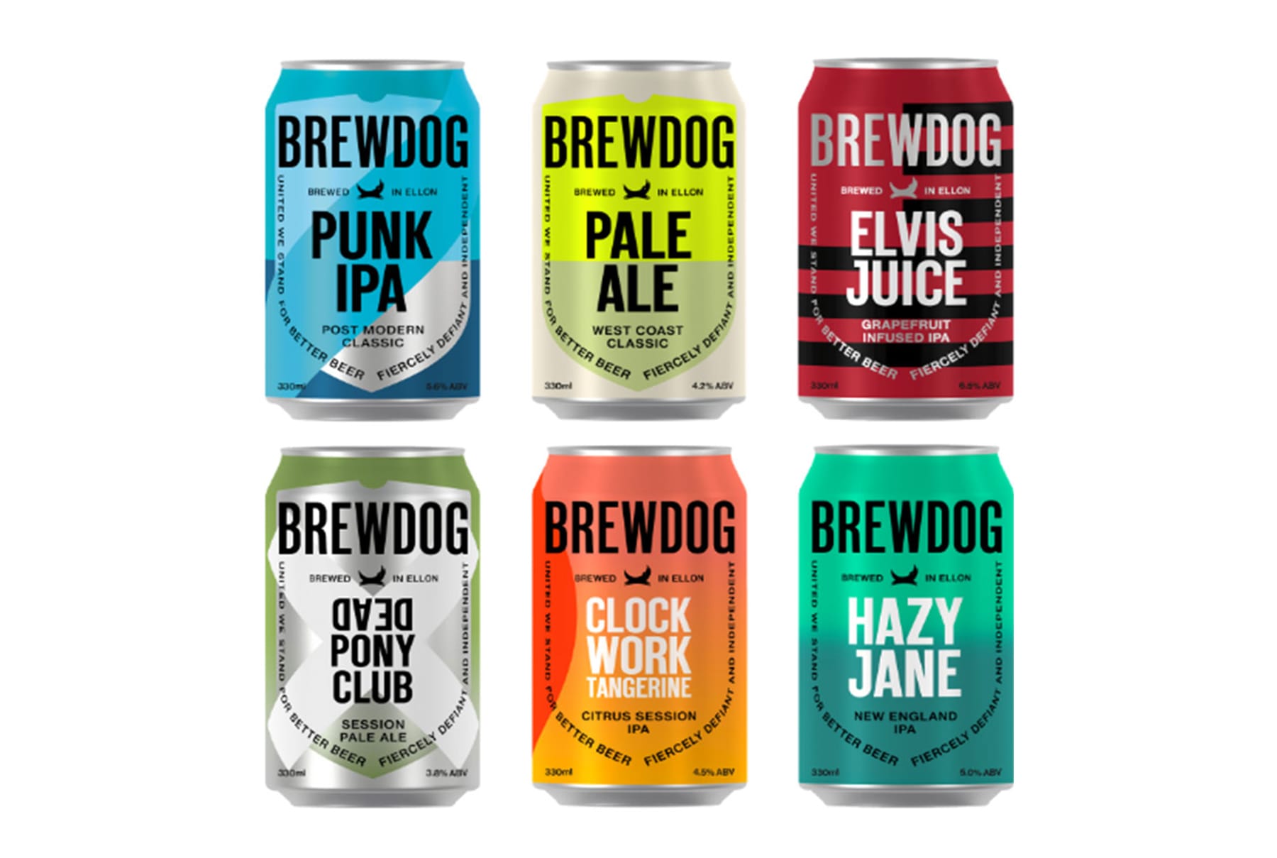
Overall the new identity looks and feels a lot more grown up. A cleaner, less fussy approach that is more in line with contemporary brand wisdom and values. The new packaging strips everything right back, the fussy backgrounds have been replaced with block colours and shapes, the typography has been rotated back to the right way and all of the grungy, distressed styling has been removed. It’s almost as if the brief was to take away all of the vital elements that that made the brand stand out on shelves so well in the first place. The logo is still there though not as profound, the typography is a lot cleaner and sharper and the colour schemes of each SKU complement each other much better now. It all seems to have shifted more towards ‘flat design’, or is it a sign that the brand is simply growing up in a more complicated world?
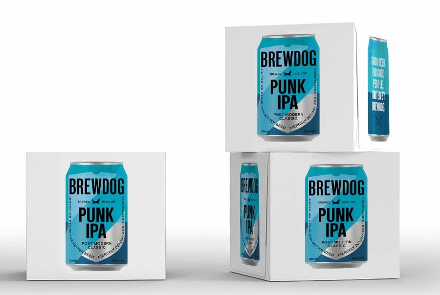
The minimalist white multipacks complement the identity really well and have great shelf-presence, the simplicity is striking and almost a new dawn in beer packaging. I think it will take time for consumers to absorb what’s been done but in time it will be embraced in the same way that when the brand was born. It needed to evolve and has been done in a way that thirteen years later feels right.
To remain relevant, the old dog definitely needed to find some new tricks to ensure a brighter future, so punk’s definitely not dead, it’s just grown up a little.
Image source: Brewdog


